
ORANGE CLEANERS
On-demand Laundry Marketplace
End-to-End Mobile + Web Experience Design
Project Summary
Orange Cleaners is a location-based, on-demand laundry marketplace connecting customers with verified laundry providers through a mobile app and a provider web dashboard. The core challenge was low trust and price uncertainty in third-party laundry services, leading to hesitation and low engagement.
I led UI and interaction design across both customer and provider platforms, translating research insights into simplified, trust-building experience patterns and transparent pricing flows.
Scope: Mobile customer app + Provider web dashboard
Timeline: 12 weeks
Role: Lead UI & Interaction Designer
Team: 1 UX researcher, 2 developers
Outcome: Engagement increased from 5% → 8% after launch iteration
Problem
User research revealed two primary adoption barriers in on-demand laundry services:
-
Lack of trust in service quality
-
Uncertainty around pricing and turnaround time
Additionally, a large portion of the target audience included older users and time-constrained professionals, requiring a highly simplified and low-friction interaction model.
The platform also needed a parallel provider interface for laundry stores to manage requests, statuses, and revenue — creating a dual-user system design challenge.
Goals
-
Reduce trust and pricing uncertainty in service selection
-
Simplify booking and payment flows
-
Design for low technical familiarity users
-
Enable providers to manage service requests efficiently
-
Create consistent status and pricing visibility across both platforms

Users & Research Insights
A structured survey (20 questions, 15 participants) and early validation exercises revealed:
-
64% users aged 40–60 → required simplified UI patterns
-
40% doubted service quality → trust indicators required
-
Primary concern: price unpredictability
-
85% check ratings before selecting service providers
-
Users wanted clarity on turnaround time and service status
These insights directly shaped interaction and information architecture decisions.
Key Experience Principles
From research synthesis, I defined the following design principles:
-
Transparency builds trust
-
Reduce cognitive load at every step
-
Make pricing visible before commitment
-
Support low-familiarity users with guided onboarding
-
Surface provider credibility signals early
-
Keep flows shallow and predictable
System Design Scope (Multi-Actor Platform)
This product required designing a coordinated experience across two user systems:
Customer App
-
Discover providers
-
Compare pricing
-
Book services
-
Track orders
-
Pay securely
Provider Web Dashboard
-
Accept/decline requests
-
Track order status
-
View revenue and ratings
-
Manage workload
I aligned status language, pricing structures, and request lifecycle patterns across both systems to maintain consistency and reduce confusion.
Key Design Decisions
Trust & Quality Uncertainty
Decision: Introduced verified provider badges + visible customer ratings
Impact: Increased user confidence in provider selection
Price Uncertainty
Decision: Designed structured rate cards and preset pricing displays
Impact: Reduced hesitation at booking stage
Older & Low-Familiarity Users
Decision: Added 3-step onboarding tutorial and simplified navigation depth
Impact: Improved early flow comprehension during testing
Map Navigation Friction
Finding: Users found location selection repetitive and tedious
Decision: Embedded map controls directly into profile flow
Impact: Reduced navigation backtracking
Provider Visibility Needs
Decision: Designed dedicated provider dashboard with request lifecycle tracking
Impact: Improved operational clarity for service providers
TITLE OF THE CALLOUT BLOCK
Design & Validation Process
Concept Exploration
-
Rapid sketching of core flows
-
Multiple layout iterations
-
Early interactive prototypes
-
Scenario-based user walkthroughs
-
Prototype Testing — Round 1
Findings:
-
Map navigation friction
-
Request tracking visibility needed
Changes:
-
Relocated map interaction
-
Added provider requests page
Mid-Fidelity Testing — Round 2
Findings:
-
Users wanted faster signup options
-
Need for instant support access
-
Need for visible turnaround time
Changes Implemented:
-
Google sign-in option
-
Support/help button
-
Turnaround time added to rate cards
Accessibility Considerations
Because the majority user group included older adults, I prioritized:
-
Larger touch targets
-
Reduced step counts
-
Plain language labels
-
Clear pricing displays
-
Minimal branching paths
-
Guided onboarding tutorial


Primary (Brand)
#3d5af1
Secondary
#ff6600
Accent 1
#22d1ee
Accent 2
#e2f3f5
Primary Text
#3d4857
Secondary Text
#8492a4

Font Type
Visual & Interaction Design
Visual direction emphasized:
-
Clean layout structure
-
Trust-signaling color alignment with brand
-
High contrast readability
-
Minimal decorative elements
-
Task-focused screen hierarchy
A/B testing was conducted on layout patterns and color emphasis to improve action clarity and CTA discoverability.


The Main Log in or Sign up page
Tutorial page 1
Tutorial page 2
Tutorial page 3
Maps page where the user can save their address
Profile page of the user
Requests page where the user can see rate cards, customer ratings, turn around time and location of the laundry store on the map.
Payment page
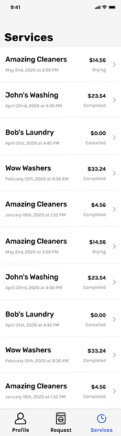
Services page which shows the list of laundry services where the user availed it, the date and time, status is also mentioned.
A 40 second example of how the app works-
UI Design of the web app-


Log in page which let's the user log in with their email and also with Google.

Dashboard which shows the user's customers and how many orders they have placed, the revenue generated for each month, customer feedback, rating etc.
The Requests page which shows in details the status of each customer, the date and time when they placed an order, whether their orders are active or not and their total billing.
Final Deliverables
Collaboration & Delivery
Customer Mobile App
-
Guided onboarding
-
Simplified signup/login
-
Provider discovery + ratings
-
Rate cards with turnaround time
-
Map-based pickup/drop setup
-
Secure card payment
-
Order tracking history
-
Support access
Provider Web Dashboard
-
Request management
-
Status updates
-
Revenue dashboard
-
Customer ratings visibility
-
Monthly performance tracking
I worked closely with UX research and engineering partners to:
-
Translate research insights into UI patterns
-
Align feasibility constraints
-
Iterate based on usability findings
-
Coordinate with offshore engineering via structured async workflows
Impact
Post-launch measurement showed:
-
User engagement increased from 5% → 8%
-
Reduced booking hesitation through pricing transparency
-
Improved provider trust through verification signals
-
Faster task completion in tested booking flows
Key Learnings
Designing a trust-dependent service marketplace highlighted the importance of transparency patterns, guided onboarding, and system consistency across multi-actor platforms. Iterative validation significantly reduced navigation friction and uncertainty.
If extended further, this product could evolve into a reusable service-booking design system supporting additional local service categories.