
Visual Design
As a visual designer, my role centers on transforming concepts into compelling visual narratives that evoke emotion, build identity and inspire interaction. Across the featured projects—ranging from festival posters and concert promotions to product packaging—I was responsible for the complete visual development including concept ideation, art direction, illustration, typography, layout design and color strategy.
Each design was approached with a balance of form and function—where visuals not only delighted but also clearly communicated the product essence.
Every project reflects my design philosophy: to combine strategic thinking with artistic expression, creating visuals that are not only aesthetically rich but also purpose-driven and aligned with brand values.

Design Explorations in Culture-Inspired Illustration


Design Process &
Visual Approach
The designs for Desi High Tea, Udi Baba, and Mission Impossible follow a playful and bold graphic narrative, rooted in strong storytelling, vibrant color palettes and stylized character forms. Each concept began with a clear thematic direction, translated into distinct visual identities through hand-drawn illustrations and culturally inspired motifs.
-
Desi High Tea features whimsical Indian elements reimagined through a high tea setting, blending nostalgia with contemporary charm. The visuals play on cultural mash-ups, pastel tones and intricate patterns to evoke a warm, inviting and humorous appeal.
-
Udi Baba merges traditional mysticism with urban street culture. The character design of a spiritual elder on a skateboard is both ironic and delightful, executed in a pop-art-meets-truck-art style. The palette uses bright contrast tones with floral backgrounds and bold typography to capture a sense of cultural rebellion and light-hearted satire.
-
Mission Impossible infuses action-movie energy with a local twist. The composition is dynamic and cinematic, using flat graphic forms, exaggerated perspectives and suspenseful framing. The aesthetic is reminiscent of comic book illustrations, with a desi twist on spy tropes and mission drama.
Designing a Symbol of Empowerment for Social Impact


Concept & Design Process
Social Media Campaign Initiative
Bindu - The Dot is a social impact campaign designed to empower rural Indian women by reimagining the bindi as a bold symbol of identity, strength and transformation. Rooted in cultural heritage and driven by a modern narrative, the campaign was built to challenge stereotypes and amplify women’s voices through compelling visual storytelling.
The design process began with deep cultural and contextual research—interviews, observations, and insights from rural communities shaped the narrative framework. Visual identity was carefully crafted using a rich red as the anchor, symbolizing resilience, tradition and revolution. I paired earthy supporting tones with bold, modern typography to strike a balance between authenticity and contemporary relevance.
The social media execution focused on emotionally resonant content—portraiture, documentary-style videos, and bold typographic statements—supported by interactive formats like reels, carousels and story campaigns. Taglines like “A dot that defines, not confines” and “Strength, courage, identity—painted in red” helped unify the message across all touchpoints.
This campaign not only honored cultural symbolism but transformed it into a vehicle for advocacy, sparking conversations and inspiring real change.
Visual Storytelling in Contemporary Book Cover Design


Visual & Design Process
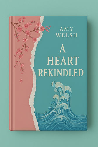
This collection of book covers—A Heart Rekindled, The Jungle and A Night to Remember—explores the interplay of narrative mood, visual metaphor and cultural resonance through distinct illustrative styles and art direction. Each cover was conceptualized to reflect the emotional tone and theme of its respective title using a mix of digital illustration, textured vector elements and clean typography.
For A Heart Rekindled, the design process is centered around duality and emotional contrast. The torn paper edge and wave motif juxtapose vulnerability and inner turbulence, while cherry blossoms soften the composition to signal healing and romance. A muted pastel palette adds to the calm and introspective tone.
The Jungle embraces a lush, storybook style, evoking the vibrant chaos and beauty of nature. The tiger’s tail playfully emerging from the foliage creates intrigue, while the symmetrical layout and warm green hues draw the reader into a wild but inviting world. The hand-lettered title maintains a whimsical character that fits the young-adventure genre.
A Night to Remember leans into a magical realism aesthetic. The dramatic contrast between the deep navy backdrop and the glowing yellow path evokes mystery, wonder and a dreamlike narrative arc. Layers of foliage and speckled light convey depth, discovery and hidden magic.
Together, these covers demonstrate a unified approach to storytelling through color, layout and symbolism—each capturing the soul of its story while standing out on the shelf.
Branded Beauty: Harmonizing Form and Function in Modern Packaging



Design & Visual Process
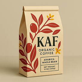
This collection showcases a cohesive and refined approach to modern product packaging, combining sleek minimalism with expressive visual storytelling. Each design underlines the core brand values while engaging its audience through purposeful composition, palette and typography.
For KAF Organic Coffee, the design embraces earthy minimalism with a muted beige background, clean serif type and hand-drawn botanical motifs. This evokes a grounded, organic feel while preserving modern elegance.
The Pink cosmetics line uses a pastel monochrome palette paired with minimal serif typography and subtle floral illustrations to establish a calming, luxurious aesthetic. This soft visual identity is carried across multiple SKUs, ensuring visual harmony while allowing each product to stand individually.
Fresh Scented Candles present a playful take on pattern-based branding. Each candle design reflects its scent profile through bold, charming symbols—hearts, horseshoes, stars—set against creamy ceramic backgrounds. The contrast between minimalist typography and whimsical motifs creates a tactile and delightful visual appeal.
Lastly, the KooK Cookies packaging takes a vibrant, illustrative route. Character-driven visuals and saturated color blocks communicate joy and indulgence. The storytelling approach, coupled with youthful typography, enhances shelf impact and emotional engagement, making the packaging as memorable as the product inside.
Across all designs, attention to material texture, silhouette and print production details enriches the user experience. This collection not only reflects a deep understanding of branding principles but also celebrates the role of packaging as a narrative device and emotional connector.
Harmonizing Color and Composition in Illustrated Event Posters

The Young Festival piece uses a playful, illustrative style filled with soft, rounded forms and a pastel-inspired, warm color palette. Its characters are in motion—dancing, singing and painting—symbolizing creative freedom and youthfulness. The central speech bubble acts as a focal anchor, guiding the viewer's eye through the content hierarchy while enhancing clarity.
In contrast, the Violin Concert poster adopts a more elegant and classical tone, with structured compositions, rich contrasting hues and deliberate use of negative space. The illustration style is refined, with soft gradients and clean vector lines that emphasize musical sophistication. The background subtly transitions into a moonlit musical score, adding rhythm and movement to the static scene.
